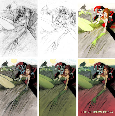
So I had someone ask if I would share my process for a painting. Well, here it is in 6 stages.
In the first panel is my initial sketch. In this stage I really worked up the nuts and bolts of my final drawing. I did my best to work out all aspects of composition, anatomy and light and shadow. This drawing is on layout paper for use when designing covers, prints and sequential pages. The actual size of this drawing is 3" by 4.5". I scanned it in at 800 dpi so I can use it as a layer later in the process.
In the second panel is my final drawing. I blew up my sketch around 300% and light boxed it onto arches hot press watercolor paper 140 weight. I make a few adjustments to the drawing as well as refining some of the details.
In the third panel I have begun painting. I used Holbein black ink to begin by hitting the darkest areas. Then added more color with watercolors and Dr. Martin inks. Being pressed for time, this was it for actual painting.
In the forth panel I've started the photoshop phase. I work in about 7 layers. 2 layers are of the painting on multiply. And then there is a layer underneath of my initial sketch, which i have enlarged and used the warp tool to make sink up to the painting as best I can. That layer is also on multiply. Then there is a layer for color underneath that layer. It's set to darken. I use the paintbrush, set to lighten or overlay to blow out the line work on the sketch layer with colors that compliment the painted layers above it. This just gives the piece a lot more texture and energy.
In the fifth panel I continue this process and add another color layer underneath for my gradients for the field.
In the sixth panel I decided i needed some red. So I used another layer set to overlay to go over my darken color layers. But this layer is still below the actual painting layers. I also add a darken color layer for the sky. Then a lighten layer for hitting the hi-lights on our characters as well as the poison dust coming from Poison Ivy's hand.The lighten layer is on top. Lastly I added some text in light yellow at the bottom. I forget which font. Anyway after getting it the right size I selected it and expanded the selection and then on another layer underneath the previous. I filled the selection with black. Then blew out the black on the word "poison" with a green, circular gradient on normal. And these last 2 layers are above everything else.
Hope this makes sense.

1 comment:
Awesome painting! It's so cool hearing about your process.
Post a Comment